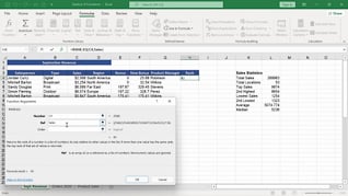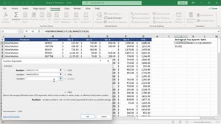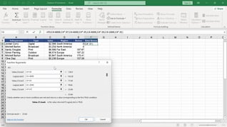
Visual data is easier to understand and act on than rows of numbers alone, making charts one of Excel’s most valuable reporting tools (Microsoft; Gartner). This course teaches you how to create polished, professional visualizations via Excel 365 charts and graphics. The course shows users how to utilize chart elements, chart formatting, sparklines, graphics, and SmartArt. You will learn how to present trends clearly, highlight key insights, and build reports that communicate information at a glance. The result of this Microsoft Excel 365 training course is simple: more compelling spreadsheets and better business communication.
Purchase Course: Great for individuals or small teams and is completed on a per-seat basis at checkout.
Bulk Discounts: Great for large teams and routes you to our sales team to set up access for your organization.
Please Note: Completing an online course may not fulfill all compliance requirements. Many OSHA and HR regulations also require written programs, hands-on training, or site-specific components. Always verify requirements with your employer or regulatory authority.
Chapters
- 1. Chart Elements
- 2. Chart Formats
- 3. Sparklines
- 4. Graphics
- 5. SmartArt