Microsoft Excel 2016 Level 2.4: Visualizing Data with Charts

- Product ID
- sonie16vd_vod
- Training Time ?
- 23 to 32 minutes
- Language(s)
- English
- Video Format
- High Definition
- Required Plugins
- None
- Number of Lessons
- 6
- Quiz Questions
- 9
- Closed Captioning
- Question Feedback
- Wrong Answer Remediation
- Lesson Bookmarking
- Downloadable Resources

Excel 2016 makes creating useful charts both easy and quick. This video-based training saves you time and trouble with its step-by-step instructions that simplify creating, formatting and modifying charts. The video shows how to select contiguous and non-contiguous data, how to determine what type of chart is appropriate for your data, and how to make simple charts, as well as sophisticated multi-axis charts with trend lines.
Chart styles and editing tools are demonstrated. This easy-to-understand video demystifies creating and modifying charts to make your data come to life. It also explains how to create and save chart templates to produce charts with a consistent look in just a few clicks.
Use this course to learn how to add value to worksheets and reveal the significance of your dataset by creating informative and visually-appealing charts.
![]() This course is in the Video On Demand format, to read about Video On Demand features click here.
This course is in the Video On Demand format, to read about Video On Demand features click here.

- Install on any SCORM LMS
- Full-screen video presentation
- Print certificate and wallet card
- You have 30 days to complete the course

Excel 2016 users
- Create Charts
- Modify and Format Charts
- Use Advanced Chart Features
- Create a Dual-Axis Chart
- Create a Chart Template
- Visualizing Data with Charts - Best Practices
-
Create charts.
- Identify several ways of creating charts.
-
Modify and format charts.
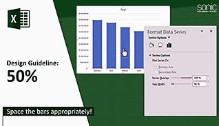
- Recognize how to improve readability of a chart.
- Distinguish between modifying a chart and formatting a chart.
- Identify which buttons will appear when clicking inside a chart.
-
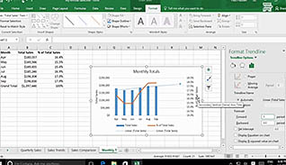
Create a dual-axis chart.
- Describe how to create a dual-axis chart.
- Recall how dual-axis charts can be used.
-
Create a chart template.
- Recall how to create a chart template.
- Identify where to find a chart template.
© Mastery Technologies, Inc.
